Slightly later this week than I intended to publish, here are my views on our 3 new kits for the 2021/22 season.
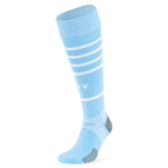
Starting with the home one…
Decent – I like it.
I didn’t dislike our last home kit at all and, in fact, I gave it a rating of 8/10 in my blog-posting this time last year.
Like many City fans, I’m sure, I was sent an e-mail questionnaire by City and I gave it 4/5 on their rating system, which suggest that I like this home kit just as much as last seasons. Well, in fact, I like it a little better.
I’ve heard that some don’t like the side panels, believing them to be a little old fashioned and plain but I see nothing wrong with them. The only 2 things that dropped it by a point for me and was the reason I didn’t give it a full 5/5, were:
1. The collar on the top would have looked nicer with a white trim.
2. The shorts should be white.
I don’t necessarily dislike sky blue shorts with our home kits – I did see our lads play in all-blue kits quite a lot as a season ticket holder in the 80s and, so, I’m sort of used to it.
But I have to admit that I think we look a lot better with white shorts and as my mate pointed out / reminded me the other day; a lot of blues have a theory that we never have a good season when we have an all-blue home strip. We shall, of course, see…
Away kit
I’ll save myself a little typing time for the next two by pasting what I wrote on City’s survey which they, once again, sent me following the release of our 2nd & 3rd kits.
I've always liked predominantly white kits as a third City strip (I’m going back some years) and I’m okay with it as a second – it’s sure better than the majority of the away & 3rd-choice abominations that City and their kit partners have produced in recent years, including last seasons.
And although I think it’s extremely noble that our club is supporting such an important venture as global safe water, it’s just a shame that the aqua-trim colours represent Xylem rather than City’s traditional colours; something that’s been lost over time for the most part over the last decade or so.
Still, I think it’s quite nice and should look dead smart on the pitch.
The only thing to add to that pre-written part is that it does come with alternative aqua-coloured shorts whenever needed. Oh…and I gave this 4/5 on their rating system too.
3rd kit
Well...I never thought I'd like a Manchester City football shirt top that didn't have our badge - in its original colour by the way - on the chest; it never even entered my thoughts that this would ever be tried. And while I first looked at it with some scepticism and while it does still look a little bit like a training top in some ways; I have to admit that it works. I’ve never been a fan of our past all-navy blue 2nd or 3rd kits – for me, navy blue isn’t necessarily traditional to Manchester City but is, instead, something that trickled in over the last couple of decades. However, I do like the tone of this blue and it does look smart when seen as a whole strip.
I also think what’s helped with regards to the “no badge” thing and the all-navy blue choice is the many woven badges within the shirt itself – I think that’s sort of been the ‘get out clause’ with regards to replacing the main badge with MAN CITY and that too, for me at least, works. I say well done.
Other than that fact that I've got my own, personal opinions on us-wearing more traditional Manchester City colours in our 2nd & 3rd strips, I would say that there's nothing that I dislike about this one really.Once again, I also gave this 4/5.
Thanks, as always, for taking the time and if you do want to share any opinions on any or all of the above kits then I always welcome comments.
I’ll be back very soon with a pre-match blog-posting before our early KO tomorrow (12:30pm BST).


No comments:
Post a Comment