I love it! I think our club / kit designer-supplier bring out some decent home kits – it’s the away & 3rd-choice kits that have been largely very questionable for a long time now, in my opinion – and I think I’ll be parting with my £70 for this one. £70! I think the last time I bought one it was £45.
There was some negative fan reaction online, when images were first officially released, regarding the maroon trim on both the neck & sleaves; specifically with regards to the fact that it looked a little red. Some called it…weird-looking. I must admit, I scrutinised the image for a time and agreed that the trim could have done with-being a shade darker.
I’m still to ‘see it in the flesh’, as it were, so perhaps it will look darker close up; certainly, when City sent out the fan reaction e-mail their close-up of the collar did appear to show the maroon to be darker-looking than in far-away shots.
Good shade of blue, I think, and the badge being in the middle seems to work on it too.
Comes with white shorts as a first choice – nothing really to comment on there; plain, nice…bit of a fleck of maroon just visible near the Puma insignia.
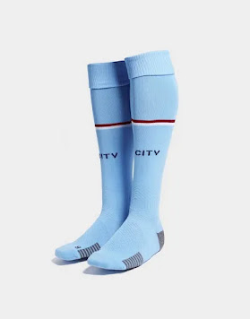
Nice, sky-blue socks with a very thin maroon & white band in the middle. I would have thought a nice thick maroon & white band at the top of the sock would have looked really good too.
This could freak a few fans out…
…especially the younger ones.
As an alternative, it comes with maroon shorts!
If the rumours are correct, whilst our away kit is gonna be black & red; our 3rd strip is going to be…get this, “Fizzy Yellow” & “Parisian Grey”.
The reason I mention that, is because when we go away to Villa or West Ham, for example, I would assume that there’s a decent chance we’ll be wearing that fizzy-midnight combo, yeah?
Well…if not, brace yourselves Blues for a sky-blue top, maroon shorts & sky-blue socks ‘little number’.
It’s gonna look a little weird to some – and it is – but it’s also going to bring back some fond, ‘on the road’ memories of the late 80s / early 90s; where the club would sometimes mash-up our home & away kits on occasions.
‘Exhibit A’, my Lord…
It’s a good video this, I think; you should watch it Blues…
Okay, my computer is now off to the shop for a service – take care all.


Don’t like it, the neck and sleeve trim is hideous and the badge doesn’t look right in the centre now that we have a shirt sponsor slapped underneath it, just looks all wrong, how anyone could like it is beyond my understanding.
ReplyDeleteKits certainly divide opinions - the club will never please everyone, of course. I do agree about the prominent Puma badge. Thank you for taking the time to read and comment too.
DeleteI love it. All just looks right.
ReplyDeleteYep, I agree. I can't see my opinion changing too much but I still want to see it altogether as a full kit on the team and to see the top close up; obviously before deciding to buy it for certain. Thank you for your comment and time, otherwise, reading my blog-piece.
Delete